What is Google Data Studio?
Let’s start with an introduction to Google Data Studio. It’s a service perfect for beginners to create interactive reports. It allows you to import information from different systems – AdWords, Attribution 360, BigQuery, Google Analytics, Google Sheets, YouTube Analytics – and visualize it in charts, tables, and diagrams, and monitor changes in real-time.
The free version provides the ability to share reports with colleagues and clients, who can make changes if they’re given editing rights. In addition, there’s always the option to simply copy a finished report (if access is granted) and fill it with the information needed. A special gallery has been created for this purpose, where you can find the most interesting ready-made reports.
What are the benefits of using Data Studio?
Google Data Studio is an excellent service that allows you to get data visualization and regular reports, avoiding the limits of 12 widgets in Google Analytics Dashboards.
Among other benefits of using Data Studio we can mention:
- It’s free.
- Over 240 Google Data Studio integrations.
- There are lots of widget types to personalize your report.
- Google-like sharing options.
- Report Gallery with free templates and ready-to-use dashboards.
Unfortunately, Google Data Studio is only a visualization tool, so you should blend and collect information, for example, with the help of OWOX BI. Use the OWOX BI products, so that you build reports on all your marketing data fast and easy.
How to access Google Data Studio
Collect data
Our short tutorial starts with these simple steps. To optimize your work without complicating the process by adding multiple sources, you need to collect all your figures beforehand in one place – for example, in Google BigQuery.
- To collect all information from different services automatically and get rid of busy work, use OWOX BI Pipeline for best practices. We recommend that you set up the cost data import from non-Google services, then connect the Google Analytics data pipeline to OWOX BI and get full raw unsampled data and build reports on full data. When directly importing one from Google Analytics to Google Data Studio, for instance, you can run into limitations of the Google Analytics system itself.
- To configure cost data import to Google BigQuery using OWOX BI Pipeline, just select an advertising platform (Facebook, LinkedIn, Bing Ads, Criteo, etc.) and provide access to it. In addition, you can use OWOX BI to add information from call tracking and CRM systems to BigQuery. Thanks to this, you’ll have the opportunity to compare costs and revenues as well as track important metrics for your business.
Once you’ve collected all your figures in Google BigQuery, it’s time to move to the next part of the job.
Uploading data
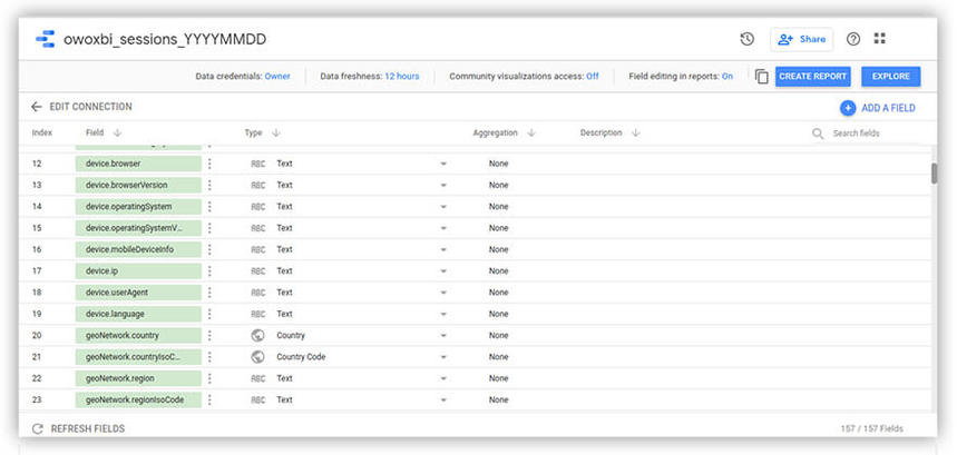
1. In the main menu, select Data Sources.
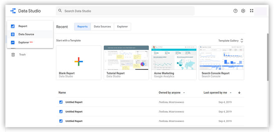
2. In the upper left corner of the screen, press the + button.
3. Select the desired connector – in our example, Google BigQuery (the datasets you’ve already collected with OWOX BI).
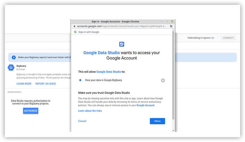
4. Next, give Google BigQuery permission to access your materials.
5. Select the desired project and account.
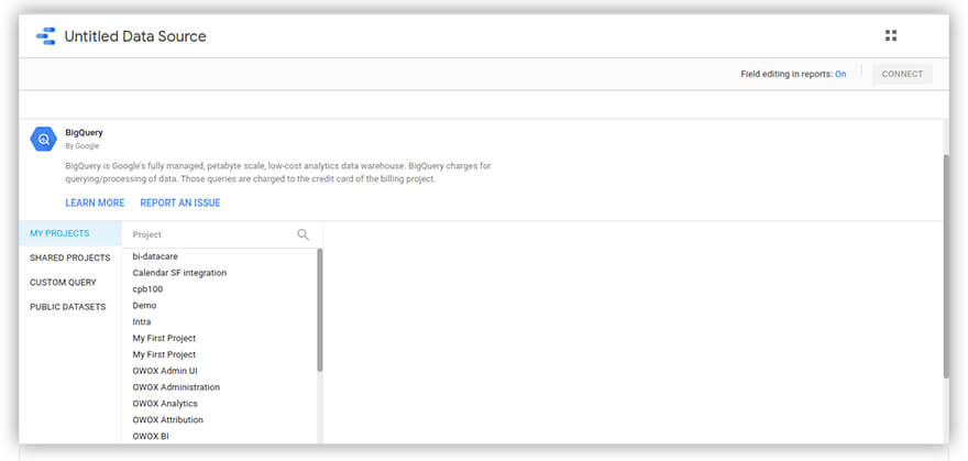
6. In the upper right corner, click Connect. All information will automatically be loaded to Google Data Studio.
Using the same procedure, you can work with other sources you need.
Create charts, graphs, and diagrams
Once you’ve connected the BigQuery, it’s time to build reports.
Data Studio provides 15 visual elements:
- Time series
- Bar chart
- Pie chart
- Table
- Geographic map
- Data profile
- Scatter chart
- Bar chart
- Area chart
- Text
- Picture
- Rectangle
- Circle
- Date range
- Filters
Conventionally, all visual elements are divided into three groups:
- Elements for visualizing
- Design elements
- Elements for filtering
To use these visual elements, you need to:
1. Click the Create Report button to go to the reporting page and free your analytical imagination.
2. Add a visual element. Just indicate which element you want to add and select the area in which you want to add it.
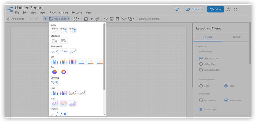
For example, say you’ve selected a pie chart. Here’s what you can do with it:
- Change the style (number of segments, color, background, borders, title of the chart, etc.)
- Change / add parameters, indicators, sorting, and filters
The first bullet point is intuitive, but the second needs a little explaining.
Here’s what you can work with:
- Parameters let report editors override default values in a source. You can select, for example, the Date Time parameter.
- Indicators are numerical values – for example, Sessions, Revenue, Goals, Cost, or your own indicators.
- There’s also a field with a filter. You can use it to recalculate indicators only for paid advertising by unchecking all sources, for example, leaving only paid advertising.
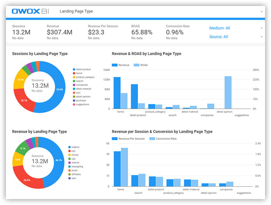
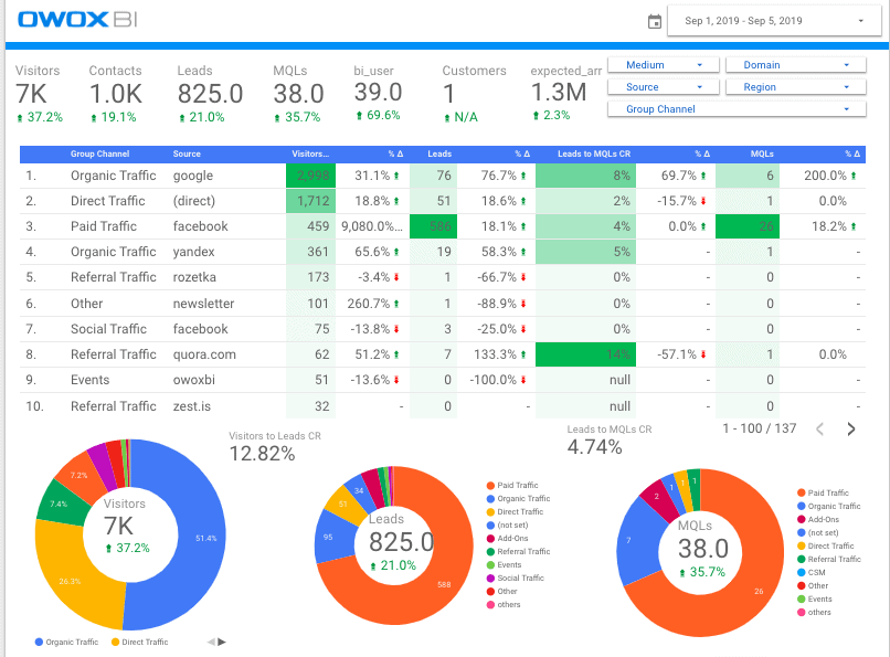
After completing all these steps and adjusting all these settings, you’ll get a visual dashboard. Here’s an example of one of these dashboards:
How to share a report with your team
The report is built, you’re happy, and you’d like to hear the opinions of your colleagues. Time to share it with your team.
There are two ways to do this:
- In the File menu, choose Open Access.
- In the upper right corner, click the Share button.
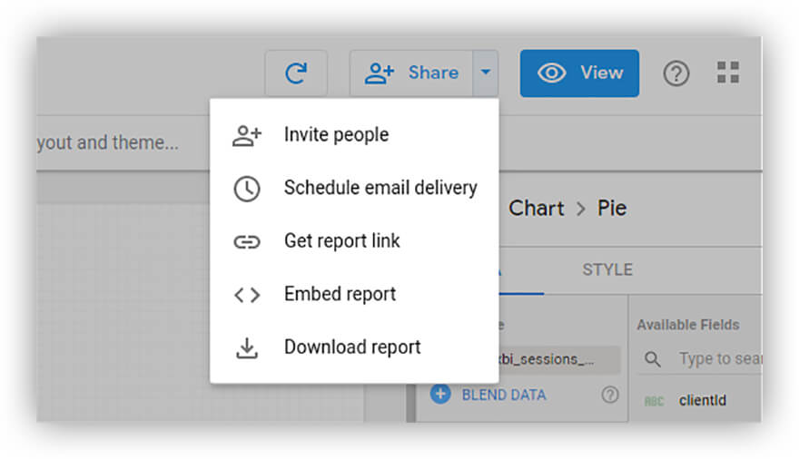
Choose whichever method you prefer.
Then add the emails of your colleagues and — voilà, the report is already in their inboxes.
How to build an advanced report with OWOX BI
Google Data Studio is a service for visualization only. To automatically run more complex calculations and build dashboards based on them, we recommend using OWOX BI products.
- Automatically import cost data to Google Analytics from Facebook, Bing Ads, Criteo, and other ad sources.
- Get all the data you need for advanced marketing analysis: OWOX BI combines information from your website, offline shop, Google Analytics, advertising services, call-tracking, and CRM systems. You don’t need to look for connectors or manually clean and process data.
- Use a simple interface of the OWOX BI Smart Data to get any reports you need. Follow our simple step-by-step instructions for creating reports in OWOX BI Smart Data, where you’ll need to specify metrics and parameters, a report type, and a date range.
- Build reports on ad campaigns (ROI, attribution), ROPO, RFM, cohort and CPA partners analysis, LTV and CAC report to measure what works best in your marketing.
- The final step is to export the completed report to Google Data Studio with one click.
Note: to build a comprehensive report, you need to collect information in BigQuery tables:
- Information on the behavior of website users, uploaded through OWOX BI Pipeline
- Figures from your call tracking system, also uploaded with OWOX BI Pipeline
- Transaction information from your CRM system
- OWOX BI Attribution Model calculation data
Below are examples of reports built with OWOX BI.
Here you can see how user behavior differs depending on the product category and traffic source:
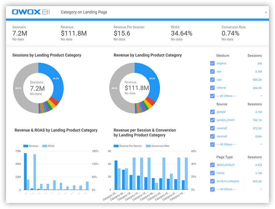
On the next screen, you can see how the conversion is distributed depending on the type of page and traffic source (the list of sources can be adjusted using a filter):
