When it comes to branding, consistency is everything.
But how do you ensure brand consistency when you have a number of departments, partners, or agencies producing your branded collateral? How can you quickly communicate your brand requirements as you grow your small business?
With a brand style guide, of course! In this post, we’ll look at how to create a style guide that clearly outlines your brand asset guidelines and that ensures professionalism and consistency in all your messaging.
We’ll also showcase our easy-to-edit templates and online editor that’ll help you create your own brand style guide today.
What is a brand style guide?
A brand style guide is a rulebook containing specifications on everything that plays a role in the look and feel of your brand–everything from typography and color to logos and imagery. It lets everyone know exactly how to present your brand to the world. It guides the design for all your content, from blog posts and presentations to office spaces and business cards.
A ton of the world’s top tech companies have rebranded over last few years, and dedicated some serious time and effort into developing thorough brand style guides.
1. Kick off your brand style guide with a great brand story
Every great brand is driven by a compelling brand story.
If you’re unfamiliar with the term, a brand story defines and describes the things that a company cares about most. It’s used to communicate a company’s values to the public, and can also help guide major decision-making within an organization.
Brand stories can look pretty different at different companies, but there is one key thread that ties them all together:
Brand stories wrap up a company’s vision, mission, and core values in one nice little package.
Many businesses draw inspiration from brand archetypes, and the best brand stories add in a dash of their own personality.
Atlassian, a well respected software company, has made their brand story all about personality. They’ve made it clear that they know exactly who they are and what they want to be, describing themselves as “bold”, “optimistic”, and “practical with a wink”.
This lighthearted stance has helped them establish their voice after a recent and dramatic brand overhaul, and I, for one, am a big fan.
Trello (acquired by Atlassian about a year ago) tells a similar brand story in 10 principles, each one accompanied by a fun custom illustration.

Either way, the brand story should always come first in a brand style guide. It sets the stage for the brand experience, and should inform the rest of the style guide.
2. Use logo guidelines to create a recognizable brand signature
Brand story aside, your logo is the most important part of your brand. It’s the one thing that everyone should immediately recognize as belonging to you, and only you.
To make a logo instantly recognizable, it has to be used consistently!
Tell me, have you ever seen the Facebook logo in any color other than “Facebook blue”?
I haven’t, and that doesn’t happen by accident.
All of the top brand style guides outline rules for exactly how to use their logos, to make sure nobody sends the wrong message with their brand.
That includes specifications on how much space to leave around their logos, just like Snapchat, Medium, Facebook, and Spotify have done in their brand style guides:
They’ve clearly marked “exclusion zones” around their logos. Usually about half the width of the logo itself, these image-free zones give logos space to breathe to ensure they maintain visual impact.
A great brand style guide also includes every acceptable color variation for a logo, making it tough to go wrong:
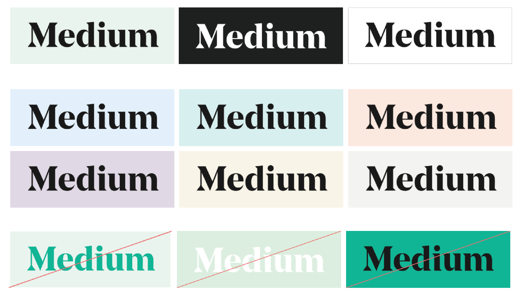
Medium has gone one better, removing any ambiguity about logo color by specifying primary, secondary, and incorrect logo color usage.
It’s usually a good idea to dictate minimum logo size here too. Figure out the smallest size at which your logo is still legible in print and on screen, and make sure it doesn’t appear any smaller than that.
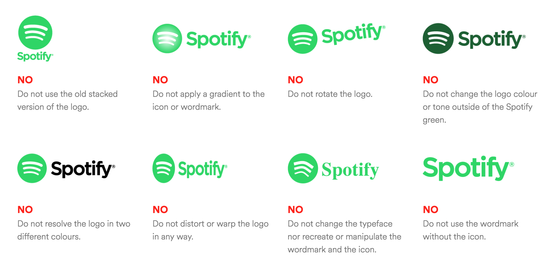
It doesn’t hurt to give some concrete examples, either. Make it dummy-proof by including what not to do:
Follow the lead of top brands like Spotify, Medium, Facebook, and Snapchat and create clear guidelines to make sure your logo is represented in the best light.
3. Include your brand’s core color palette in your brand style guide
In the past, brand colors were simple. You might have had to pick one or two colors that matched with your logo, and you were all set.
But that’s all starting to change.
Many companies are now using multiple color schemes to add vitality to their brand communications.
To keep brand recognition intact, it’s more important than ever to make core brand colors well known and consistent.
In your brand style guide, clearly define your brand’s color palette. Whether you, like Twitter and Snapchat, have one primary brand color and some secondary shades:
Or like Netflix, you have specific color combinations you want your designers to stick with:
It’s a good idea to make your core brand colors absolutely clear. Don’t forget to include the necessary hex codes, RGB values, and CMYK color codes to make sure your colors are presented consistently across media.
Brands like Trello that rely more heavily on color to express functions and components of their product tend to develop more comprehensive color systems. Spelling out every shade of each color in their palette means no more fiddling around with color pickers!
Atlassian has gone the extra mile to come up with color combos that pass web accessibility standards, and given some handy examples of good and bad color contrast:
On top of the social media graphic design trends of the moment, Spotify has even included realistic examples of where not to use their distinct “Spotify green”:
Whichever way you shake it, the more examples the better when it comes to color in your brand style guide. Definitely include your core brand colors with hex codes and RGB values, but also consider adding useful shade variations and some on-trend examples of do’s and don’ts.
4. Choose typography that matches your visual style
Typography is one of those things that goes unnoticed if it’s done well, but sticks out like a sore thumb if it’s not. Allowing font choices to slip under your radar can really cheapen your brand.
To enhance your brand experience, use a brand style guide to ensure you’re applying typography consistently across your collateral.
This means outlining what fonts are used for what purposes (in print and on the web).
Twitter and Snapchat have both kept it simple, each choosing one font to use for pretty much everything:
Funnily enough, Trello has chosen the same typeface as Twitter, but takes it a few steps further by specifying a design hierarchy of font styles and sizes, text colors, and styles for lists and paragraphs:
Depending on your product or business, sometimes it’s necessary to specify different fonts for different platforms. iHeartMedia has left nothing to chance by including options for Android, wearables, Microsoft products, and even autos:
Some companies even design their own fonts! If you do, it’s a good idea to include fallback options for external use:
Overwhelmed?
Don’t worry. A simple brand style guide doesn’t need to this extensive – just focus on your most used fonts, usually just one or two. Specify your font and design hierarchy with respect to font sizes (big for headers, medium for subheaders and smaller longer paragraphs) and font weights (light, bold, heavy, etc.):
5. Find your brand voice
The importance of having a consistent brand voice in your messaging should not be underestimated.
Spend some time finding the style that resonates with your audience and aligns with the personality of your brand.
Once you have it figured out, ensure that it’s replicated across your channels by spelling it out in your brand style guide!
Shopify has gone above and beyond in defining their voice–including a ton of do’s and don’ts for grammar, punctuation, spelling, vocabulary, naming, and tone. By giving tons of examples they make it impossible to go awry with messaging.
On the other side of the spectrum, Atlassian has kept it short and sweet, simply outlining their writing style in a couple brief sentences. Sometimes that’s all you need!
Once again, Skype has knocked it out of the park with a simple but effective summary, contrasting words that they like with words that they don’t like.
6. Include image and data visualization guidelines in your brand style guide
Last but certainly not least, it’s time to talk imagery. Everything about your imagery, including style, color, and content, contributes to the perception of your brand.
Create some guidelines for imagery (photos, illustrations, charts, infographics, etc.) to include in your brand style guide.
What might these guidelines look like?
Well, Trello loves to feature custom illustrations, but knows it can be hard for different artists to produce illustrations with a cohesive style. They leave nothing to chance by outlining what it means to make a “Trello-y” illustration–with guidelines on concept, composition, shadows, and more.
Most importantly, they give examples!
Along the same vein, Shopify goes all out, specifying when and where to use illustrations, the principles with which to critique illustrations, and the stylistic choices (like background color, level of detail, scale, and blending modes) that make an illustration “on-brand”.
Illustration principles from Shopify’s brand style guide.
Atlassian takes a more minimalist approach, wrapping their illustration style up with words including “practicality”, “optimism”, and “friendliness”.
Photographic style is just as important as illustrative style. If you use photographs frequently in your branding, your style guide should specify the level of complexity, compositions, color schemes, styles, and technical specs that make photographs fit within your brand.
If your branding features infographics or data visualizations (which it definitely should), don’t forget to include some stylistic guidelines for them as well.
Specify when and where to use infographics and data visualizations, and include style preferences and technical conventions.
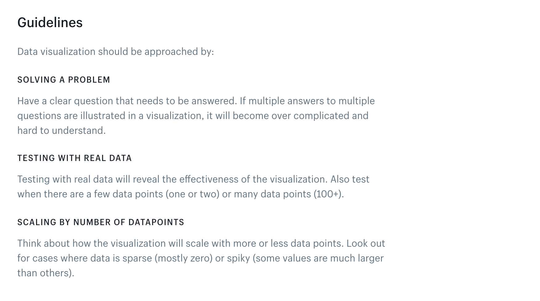
Shopify gives their designers clear directions on how to approach a data visualization:
Followed by some definitive rules for labeling and styling those visualizations:
Guidelines such as these are easy to overlook, but when used properly go a long way towards fostering a cohesive brand presence – especially for more complex media like infographics and data visualizations.
Conclusion
Don’t send mixed messages when it comes to your brand.
Take inspiration from today’s top brands and make your own brand style guide to allow everyone representing your brand to produce collateral quickly, efficiently, and with confidence. Build one with these 6 simple steps:
- Kick off your brand style guide with a great brand story
- Use logo guidelines to create a recognizable brand signature
- Include your brand’s core color palette
- Dictate your typography hierarchy
- Define your brand voice
- Specify the imagery and iconography that makes up your visual style
Or work with one of our pre-designed templates–just pop in your own branding and you’re off to the races!


