he final piece to the email conversion puzzle is to give your readers a compelling reason to click.
If you’ve read the previous chapters of the Ultimate Guide, you know how to write effective subject lines and content that clearly communicates your message. There’s just one last step to complete your email masterpiece.
You need a call-to-action (CTA) that works!
In this chapter, we will share everything you need to know about CTAs—from the placement to button text and design. But first, we’ll let you in on the secret to a successful email call-to-action.
The secret behind a CTA that works
The best CTAs are more than just a bright button with catchy text. The reality is that every element of your email contributes to making the CTA work.
A successful CTA does not function independently. Instead, CTAs work more like the climax of a compelling story.
Every great story follows the same format. First, you are drawn into the story, then you learn the premise, which ultimately builds until you reach the most important part of the story—the climax.
The end of the story depends on what happens at its peak. This is how email conversions work as well.
What is a CTA in email marketing?
The CTA is the climactic point of the email. It’s where the story has reached an inflection point and the reader gets to decide how the rest of the story plays out. And like the climax of a story, the CTA doesn’t work unless the other parts of the story build up enough interest.
You need to build the story with the subject line, content and design. By the time the reader gets to the CTA button, they are primed and ready to click.
Do your subject line, content and CTA work together to create a cohesive story that leads potential customers to take action?
Where to put your call-to-action
It’s important to note that there are lots of different types of email formats and layout options, which affect the placement of your CTA buttons.
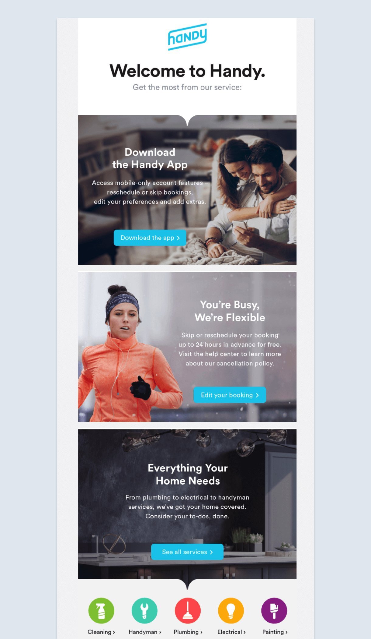
If you have a newsletter with multiple topics leading to different pieces of content, the secondary CTA buttons should be clearly aligned with each section.
Here is an example from Handy. Their welcome email contains multiple calls-to-action that are organized really well. Your eyes start at the top and follow the flow of the CTA buttons down.
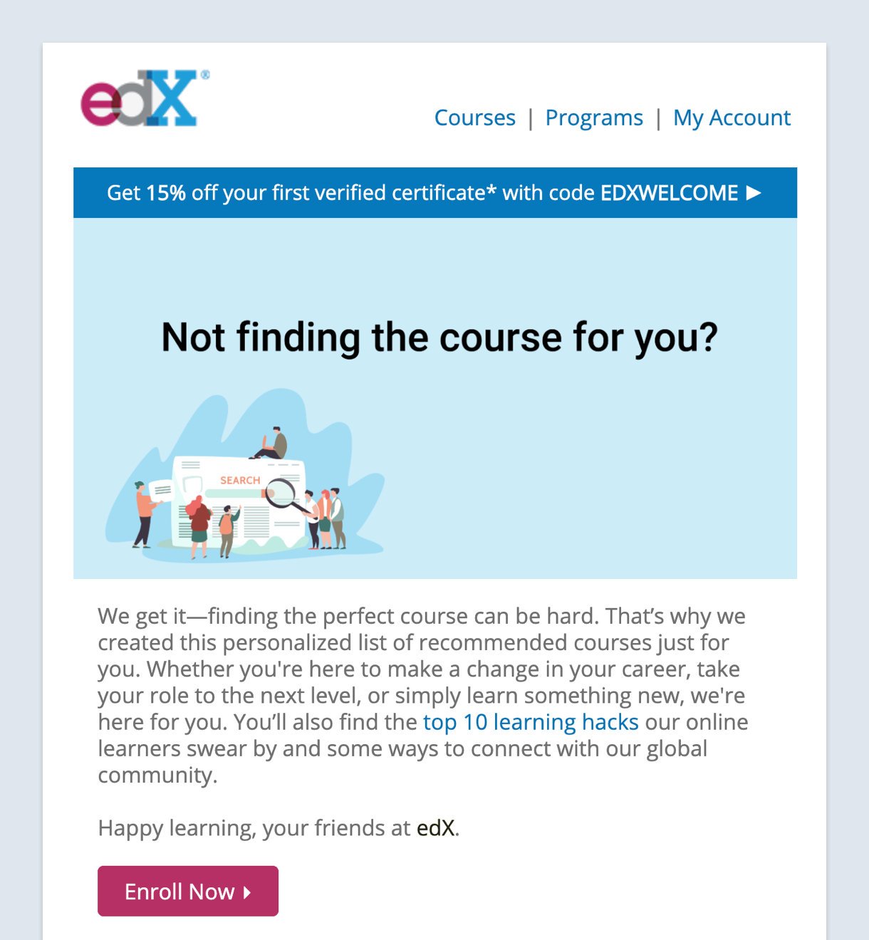
For email campaigns that have a singular focus with one CTA, the placement should follow the logical progression of the story. People typically read from the top left to right of an email, so it makes sense to place your CTA buttons towards the bottom or to the right of the content.
See what edX did with their promotional email. They neatly aligned all their content to the left, just like you would at school!
If the content builds enough interest, the call-to-action button will be waiting at the right place to encourage more click-through rates (CTRs).
Make sure the CTA newsletter links to a landing page that complements the email content and continues the story to ensure a cohesive experience.
Lastly, don’t assume the reader only clicks on the CTA button. Curious people often try to click different elements in the email like the logo, headlines, and images. Consider adding the same link to those elements if you think it will help the reader.
How to write call-to-action text
Read more.
Learn more.
Click here.
Submit.
Download.
Sign up.
Buy now.
Shop now.
Everyone has seen these CTA words a million times. These words are not only overused by email marketers, but they sometimes cause friction with the reader because you are asking them to do work!
When you use generic text, you are missing an opportunity to get more clicks.
A link to your website in the footer of your email is not a “Call-to-Action”… it’s an afterthought. Your Call-to-Action is a core piece of your message—it tells your prospects what you want them to do, and how to do it. Common Calls-to-Action include words like click, reply, call, register, subscribe, and download.
The most successful Calls-to-Action are:
Clear: Tell your prospect exactly what to do and what they’ll get.
Frequent: Give your prospects multiple chances / reminders to act, including near the beginning of your email (in case they don’t read any further).
Focused: Prompt your prospect to take one action only—no irrelevant or distracting links.
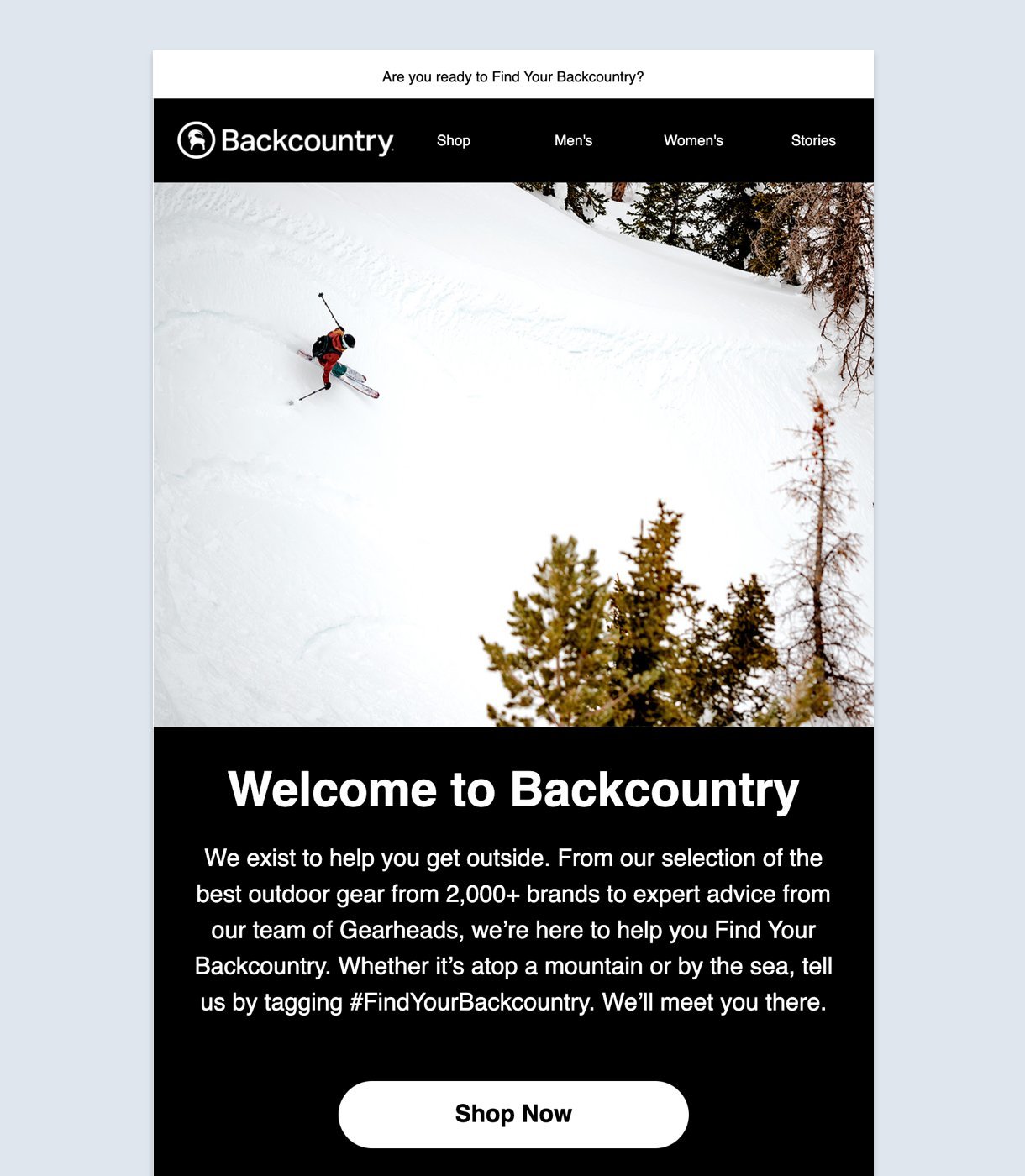
Backcountry, an e-commerce outdoor gear and clothing store, starts well asking if you’re ready to “find your backcountry” and builds upon the story throughout the email.
But, just at the precipice, it ends with a “Shop now” button that links to the homepage. Don’t you think you’d be more motivated to click ahead with a “Find my gear” CTA?
People already know that you want them to click something. The trick is to let them know what is in it for them by highlighting benefits, setting expectations and making it personal. End the story with a satisfying finish!
So, what CTA words should you use? Here are three ways to write the text in your CTA buttons with smart copywriting:
1. Speak directly to your subscriber
Email is personal. Try speaking directly to your subscriber like you would a friend or colleague. A recent study by Unbounce showed that using the first-person pronoun in your button text resulted in a 90% increase in clicks.
For example, MyGiftCardSupply uses a second-person pronoun to “Snag Your 10% Off”. What if they had simply used “Get 10% Off” instead?
This small change in words can make a huge difference. As a subscriber, you feel that this discount is just for you.
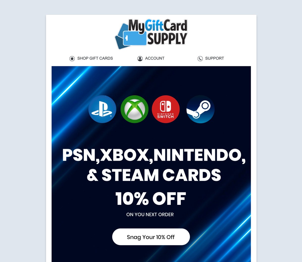
Also, their email’s value proposition is stated clearly in the button text, a 10% discount. Not just any discount but a sizable one. So you’re tempted to click and enjoy that benefit. Would you have acted if it simply said, “Get your discount”?
2. Use approachable action verbs
Not all action words work. Some verbs make the reader uncomfortable or even stressed. These words include verbs like submit, enter and download. Is this how you talk to people in person?
Instead, try words that let the reader know they are getting something in return. Approachable action verbs like get, find and try tell the reader there is a benefit waiting for them. For best results, combine these action words with an actual benefit to seal the deal.
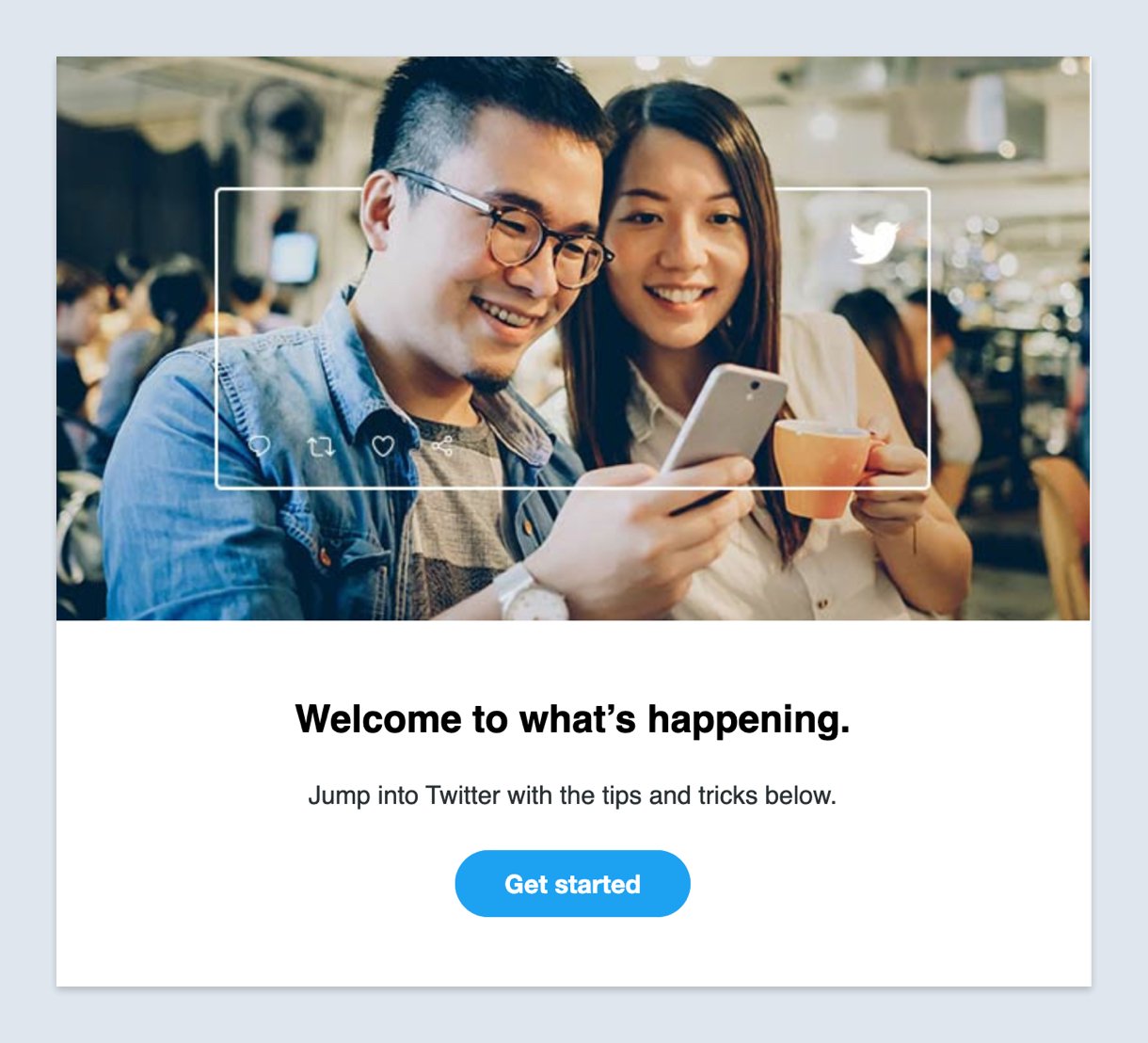
Twitter needs no introduction. Their welcome email shows a fluid environment of breaking news and tweets. Their “Get started” CTA works well here because they use an inviting action verb along with something tangible for the reader: staying informed with what’s happening now.
3. Create urgency
If you have a limited offer or your email is time-sensitive, use it to your advantage with an effective CTA that raises the sense of urgency. People hate to miss out, especially with limited e-commerce deals! Use button text that lets your reader know that they must act now to enjoy the benefits.
While it’s easy to add the word “now” at the end of your button text, try experimenting with phrases that raise the stakes. For example, “Experience it before your friends” or “Offer ends 6:00 PM”.
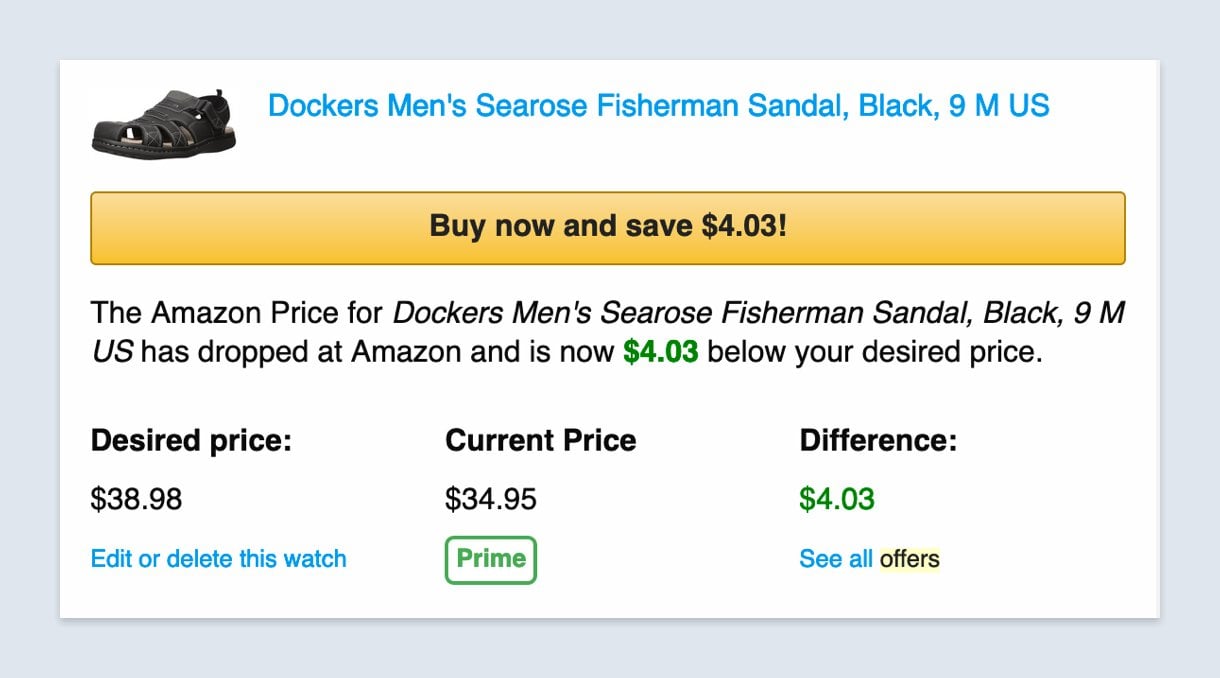
CamelCamelCamel, an Amazon price tracker, uses an especially large CTA button to urge you to “buy now and save” before the price rebounds. The button is designed in a familiar style that encourages high CTRs to the product page on Amazon.
For something a little different, MailerLite has a countdown timer that you can insert into your email to heighten the urgency. Simply drag the countdown block into your newsletter and set the date and time. The countdown time is then automatically set based on the timezone of the sender.