Quizzes
Participants 286
-
 Anna
Anna
-
Popova
-
* * * 💷 Ваш аккаунт пополнен на 71598.36р. Подтвердите средства по ссылке: https://professionalheights.com/uploads/wntrxn.php?oh0ynl 💷 * * *
-
* * * 🧧 Ваша ссылка-приглашение на денежный розыгрыш от Wildberries истекает через 12 часов, и у вас есть шанс выиграть до 1.000.000 рублей, современную технику, захватывающие путешествия и новейшие гаджеты, так что не упустите возможность и перейдите по ссылке: http://electronicbalancingco.com/uploaded/yvyufe.php?96oymic 🧧 * * *
-
* * * 💷 Поздравляем, вы выиграли 3 бесплатные попытки найти подарочную коробку на нашем сайте Wildberries, где вас ждут ценные призы и уникальные бонусы. Переходите по ссылке: http://masonrthomas.com/upload/aqmaqq.php?0oo7sh (действует 24 часа) 💷 * * *
Whether it’s design or content, Google’s approach is to focus on the user, and everything else will follow. Maggie Stanphill, a senior UX writer at Google, and her colleagues Allison Runa and Juliana Appenrodt presented about the power of UX writing at Google I/O 2017. The talk is full of valuable lessons that can be adapted to any project when considering how words can help make your product stand out.
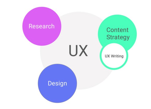
Google’s view of UX involves research, design, and content strategy (which overlaps with UX writing). While many people see design as the biggest focus of UX, this view gives equal weight to research and content strategy, further emphasizing the importance of content and writing in the creation of successful products.
Google’s model for UX.
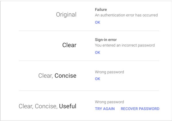
Google’s approach is that UX writing best practices should be clear, concise, and useful. Removing technical terms helps ensure that the message focuses on the user perspective . The example below presented in the Google I/O talk shows how small changes in an error message can make a big difference in what, and how, you are communicating with the user.
Google shows how small tweaks are able to make a message more clear, concise, and useful.
There is a lot of talk in UX writing about keeping text short, concise, and succinct, but keep in mind certain situations will require more text.
It also can be fun to add a touch of humor and personality to your product. MailChimp and Slack are excellent at this. However, you need to make sure it fits your brand and ensure it’s effective and communicates your message. You don’t want to do something to turn off your users. Never try to force it. You can always test out ideas on users through usability or A/B testing.
Keep collecting screenshots of examples of strong UX writing that you encounter. You never know how they may inspire future projects. Every product or website is going to have different content needs.
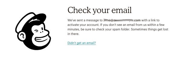
MailChimp wants to make sure you don’t miss a step in the sign up process by explaining the next steps, and telling you to check your spam folder as well. If you still don’t see the email, you can click the link.
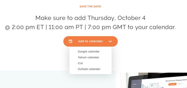
The save the date for a webinar confirmation screen includes a feature with a drop down menu to add it to your calendar. Different time zones are listed for clarity, as attendees may live anywhere in the world.
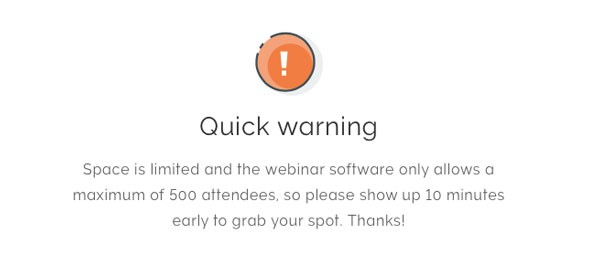
Even a warning box can have friendly text to help manage expectations for users. This note at the bottom of a webinar sign up screen warns attendees that the event is popular, so they should arrive early.
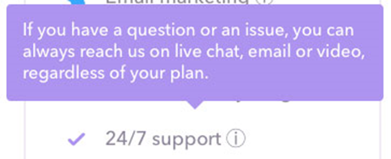
The scroll over information bubble in a list of features gives the user more details about what 24/7 support entails.
Words that improve performance
Even though you know the value of great content, convincing the rest of the team and stakeholders may take a bit more effort, particularly when a team is small and resources are limited. Sharing success stories can help convince others of the value of UX writing.
Microcopy is the term used to describe small bits of text that can have a big impact on a user experience. They can be anything from simple instructions, to the words on or a button, or a tip that help you if you forgot your password. Similarly, microinteractions refer to the small design details (such as the number that appears in your Amazon cart) from a design standpoint, microcopy can work with design elements to maximize the message or desired action for users to take.
Let’s say you’re visiting the Hemingway app editor website and you’re interested in buying the desktop version. Your credit card isn’t nearby, but thankfully the small text that appears at the bottom of the call to action box lets you know that there is an alternative option for payment. By anticipating what the potential customer may be thinking or feeling, the company is able to make more sales and minimize the number of drop-offs after the next screen.
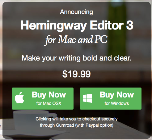
“Buy now” is a clear call to action. There is a separate button for Mac and Windows users. The text below the buttons reads “Clicking will take you to checkout securely through Gumroad (with PayPal option).” The text is friendly and informative. It also helps put the customer at ease by using the word “securely.”
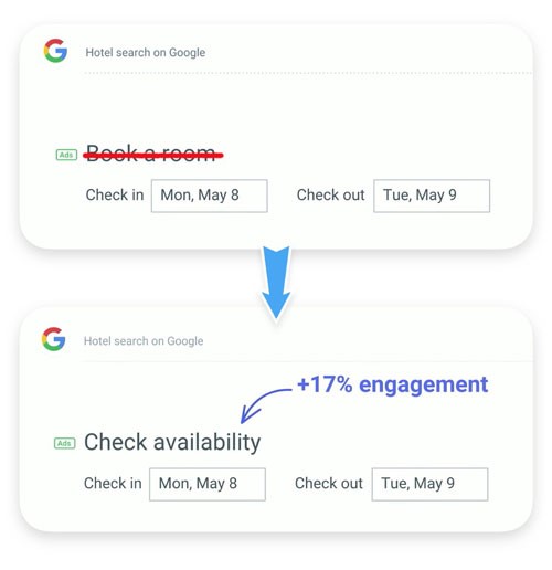
In the Google i/O talk presented above, the example of a Google hotel search feature was given to show how simply replacing the text “Book a room” with “Check availability” led to a 17% increase in engagement. This was done through A/B testing where the design stayed the same, and only the copy was changed.
If you think about it from the perspective of a user, it makes sense. For many people “Book a room” may feel more committal, and how do you know the dates are even available? The phrase “Check availability” strikes a nice balance between finding a room and helping drive the experience forward.
Another way you can increase the likelihood that people will read your content is through the use of headlines (or “headings”) to help break large chunks of information. Not only will this make it easier for people to scan the document and gain an understanding of what the text says, but it also is a way to help improve SEO as search engines crawl through the text to find keywords.