Participants 286
-
 Anna
Anna
-
Popova
-
* * * 💷 Ваш аккаунт пополнен на 71598.36р. Подтвердите средства по ссылке: https://professionalheights.com/uploads/wntrxn.php?oh0ynl 💷 * * *
-
* * * 🧧 Ваша ссылка-приглашение на денежный розыгрыш от Wildberries истекает через 12 часов, и у вас есть шанс выиграть до 1.000.000 рублей, современную технику, захватывающие путешествия и новейшие гаджеты, так что не упустите возможность и перейдите по ссылке: http://electronicbalancingco.com/uploaded/yvyufe.php?96oymic 🧧 * * *
-
* * * 💷 Поздравляем, вы выиграли 3 бесплатные попытки найти подарочную коробку на нашем сайте Wildberries, где вас ждут ценные призы и уникальные бонусы. Переходите по ссылке: http://masonrthomas.com/upload/aqmaqq.php?0oo7sh (действует 24 часа) 💷 * * *
Introduction
Data Science is all about dealing with data and an important subset is Data Visualization where you communicate and present the information of your final result in an interactive and visual manner. Other than using data visualization for presenting results to end-user, I often used data visualization in different steps of the data science process such as before data pre-processing to give me a better understanding of the data and also during the modeling step where I visual my forecast result in different charts to see how is the model performing again historical result (especially for time-series forecasting).
About Google Data Studio
Google Data Studio was first introduced as a beta version in 2016 and has become a common tool used for data visualization — why?
- User Friendly
- Compatible with multiple data sources (Eg: MySQL, Google Analytics, Google BigQuery, PostgreSQL, Youtube, excel files, etc.)
- Live Data Connectors — seamlessly integrates with multiple data sources and refreshes your reports
- Price — Free for every user to use!
- Personalization — customize your dashboard based on charts, colors, metrics of your choice
- Share and Collaborate — You can share your reports with others or with everyone!
Let’s begin learning how to build interactive visualizations with Google Data Studio.
Getting Started
To begin, log in to Data Studio with a Google Account — https://datastudio.google.com/ and you will be direct to the Data Studio main page:

From the main page, notice that Google Data Studio offers a wide variety of templates to jump-start your process. From the template, you are able to customize the charts, fonts, colors based on your personal preference. (If you are choosing a template to begin — choose a relevant template based on your topic!)

For this tutorial, we will start with a blank report to have a better understanding of how to build your own dashboard from scratch. Begin by selecting: (+) Blank Report.

Adding Data Sources
After opening up a blank report, the first thing to do is connect to a data source which is also the building block of a dashboard. Google Data Studio will prompt you with the option: Add data to report. There is a wide variety of connectors that are being offered by Google Data Studio, let’s connect with a public data set from Google Big Query.

The Public dataset that we will be using for this tutorial is — London Bicycle Hires which is available in Google Big Query Public Datasets (Source: data.london.gov.uk). This data set contains information on the number of hires of London’s Santander Cycle Hire Scheme.

Upon adding the data to the report, Google Data Studio automatically tabulates a table based on the understanding of the dataset provided.

Let’ remove the table created as we want to build from scratch — Right-click “Delete”.
Metrics & Dimension
Two important terms to understand before begin building visualization is the term “ Metrics” and “Dimensions”.
Metrics — are numerical measurements in your data and expressed in numbers form. (For example, sales value, time, duration, etc.)
Dimensions — are categorical values in your data. (For example gender, country, city, etc. )
So when building a chart, dimensions are used to break down the metric values. For example:
- Sales value (Metric) broken down by city (Dimension)
- Number of children (Metric) broken down by gender (Dimension)
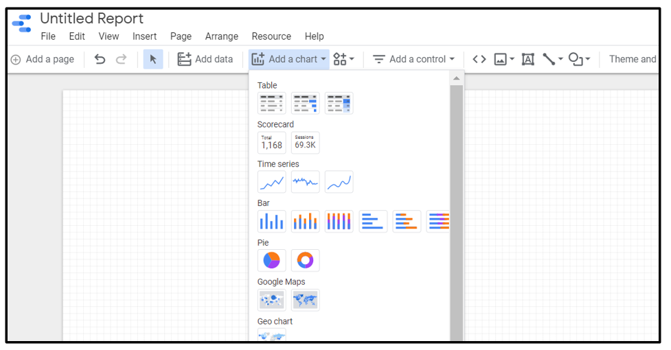
Adding a “ Bar Chart”
Now let’s add in our first visual — a bar chart. From the toolbar, click “Add a chart” and a dropdown with a list of different charts where you can pick the chart that you would like. Here, I will be selecting a horizontal bar chart.
A “bar chart” will be added to the report upon selecting from the drop-down menu. Select the bar chart and you will notice you can configure the data displayed on the bar chart from the right-hand pane. Here, I choose to visualize the Top 10 stations with the highest number of rentals.

On the right-hand pane configure the following option:
- Dimension: start_station_name
- Metric: Count(rental_id)
- Sort : Count(rental_id) , descending

Next, as we have a total of 880 different “start_station_name” in our dataset, let’s choose to visualize the top 10 most popular station that rider often takes. We can configure this under the right-hand pane — “Style” tab and limit the number of bars to “10”.

Customize your “Bar Chart”
This is my most favorite part when building dashboards is changing the colors of the bar chart based on my own personal preference. From Google Data Studio this can be done on the right-hand pane — “Style” tab.

On the right-hand pane — “Style” Tab configure the following option based on your own preference:
- Color by: Select a color of your choice
- Reference Line: metric: rental_id ; calculation: Average
- Font of your choice
- Chart background and border color of your choice
Adding a “ Line Chart”
Other than the bar chart, let’s now add a “Line Chart” to visualize the total number of rentals across a time period. Line charts are helpful to see how the volume fluctuates across a time period. Similarly, from the toolbar, click “Add a chart” and pick “Line Chart” from the drop-down menu.

On the right-hand pane configure the following option:
- Dimension: start_date
- Metric: Count(rental_id)
- Sort: start_date, ascending

Creating a “Dual-axis Line Chart”
Continue from our current line chart, let’s create a dual-axis chart by adding another metric to it. Dual-axis charts are often used to visualize the relationships between two different metrics with different scaled of measurement.

Select the Line Chart and on the right-hand pane add the following metric:
- metric: sim(duration)
Notice after adding the second metric, the values for total rental_id on each date are not so visible anymore. This is because both lines are plotted on the same axis and have different scale measurements. To solve this issue — create a line chart with dual-axis by plotting the second metic on the right-axis. This can be configured under the right-hand pane “Style” Tab.
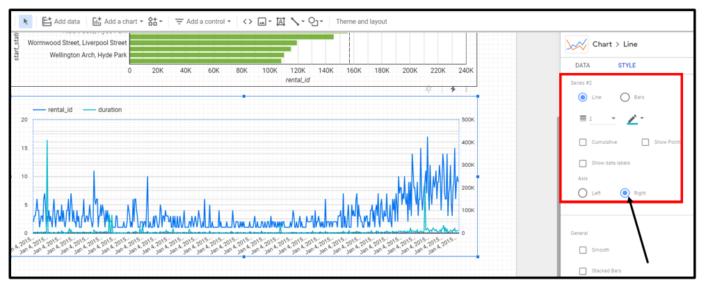
On the right-hand pane — “Style” tab, configure the following option:
- Scroll to Series #2 — which represents our second metric: duration
- Axis: Right
Now view both lines clearly on the line chart, except it might be too cramped with so many dates plotted on a single chart? Let’s fix this by grouping the data by month and adding date range options.
Group data by month & date range options
To group the values by month, configure by selecting the calendar icon under the dimension for “start_date” on the right-hand pane.

On the right-hand pane — “Data” tab, configure the following option:
- Under dimension — select calendar icon
- Pick Date & Time → “Year Month”
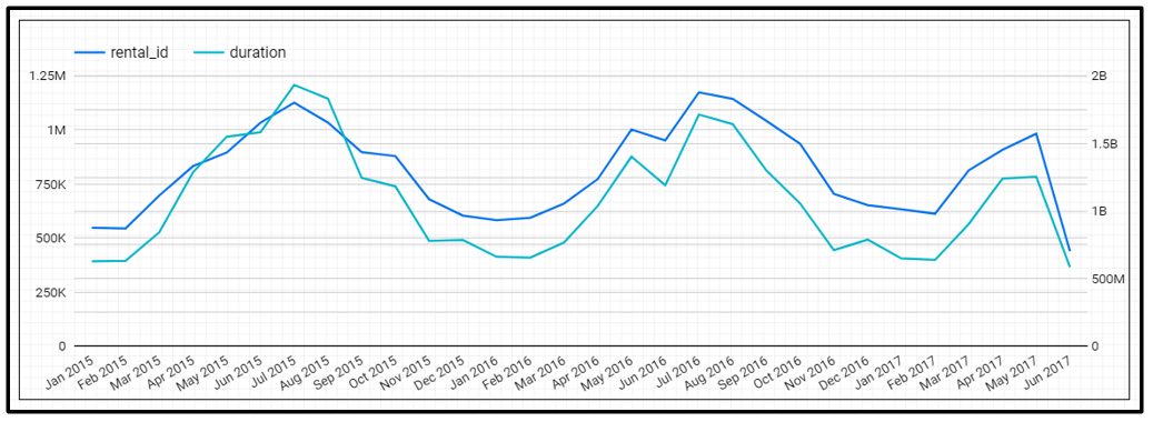
Now, we can have a better view of the total rentals and duration across each month from 2015 to June 2017. Additionally, we can add a filter option to select the date range of the period to be viewed.
Before pulling in the date range control option, add “start_date” as the Date Range Dimension for both charts at the right-hand pane. With this dimension added, both charts will be filter based on the value selected by the data range control.

Next, from the toolbar, click “Add a control” and pick “Date range control”

Set the Date range control properties to “Auto date range”. With this option, users can pick their range of dates from a calendar view.

To test the “Date range control” filter, switch the report to the “view” mode.

The “View” mode displays the dashboard in a non-editable form where you can preview and interact with the dashboard. In the “View” mode, test the “Date range control” by selecting a range of dates and apply to the report. (Here, I’m selecting from February 2016 — February 2017)

Observe the changes in the charts based on the date range selected. Notice that the bar chart values have decreased and the line chart date range is based on the selected date range.

Adding a “Scorecard”
Other than plotting charts, we can add scorecards to our dashboard. Scorecards display a summary value of a single metric. Common uses of scorecards are used to view — total sales, total orders, average sales, maximum value, etc.
To add a “Scorecard”, select from the toolbar, click “Add a chart” and pick the “Scorecard” of your choice.

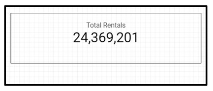
Let’s use the scorecard to view the total number of rentals. Similarly, the data used for the scorecard can be configured on the right-hand pane.

On the right-hand pane configure the following option:
- Date Range Dimension: start_date(Date)
- Metric: Count(rental_id)
In addition, we want the title of the scorecard to be “Total Rental” instead of the default column name. Let’s rename the metric for “rental_id” to “Total Rental”.
- Hover on the “CT” metric under the Metric option for rental_id and a pencil icon can be seen.
- Click on the pencil icon and add in “Total Rentals” under the Name section.

After renaming the metric, our scorecard title will be based on the name provided by the metric. Other than that, adjust the padding of the scorecards on the right-hand pane “Style” tab according to your own preference.
Repeat the same process to create another scorecard by using the metric: sum(duration) and renaming the metric to “Total Rental Duration”.

Adding “Text / Chart Title”
Text can be easily added to the report using the “Textbox” option available under the toolbar. Let’s quickly use the “Textbox” option to add a chart title for our bar chart and line chart.

After adding the textbox, you can configure the style from the right-hand pane based on the font style, font color, text alignment, and background color of your choice.
Before we wrap up and finalize the design of our dashboard, let’s add another filter option — “Slider”.
Adding a “Slider” control
Slider control allows users to filter based on a range of values for a numeric dimension. Let’s add a slider for users to select based on the duration of the rental.
To add a “Slider”, select from the toolbar, click “Add a control” and pick the “Slider” option. Specify the control field to be used for the slider on the right-hand pane “Data” tab.

On the right-hand pane configure the following option:
- Date Range Dimension: start_date(Date)
- Control field: duration
In addition, we want the title of the slider to be “Rental Duration” instead of the default column name. Let’s rename the metric to “Rental Duration”.

Adding “Theme and Layout”
Lastly, we can apply a “Theme and Layout” to the report. Themes help to pre-defined a set of color and style combinations based on the theme selected.
From the toolbar menu — there is a “Theme and layout” option. Selected that option and you can select the “Theme and Layout” of your choice on the right-hand pane.

After selecting your preferred “Theme and Layout”, your dashboard is almost done. View your final dashboard result in the “View” mode and you can start sharing your reports with others using the “Share” options or download the report in PDF format.

Conclusion
Data Visualization is an important skill set as a Data Scientist as it helps to get a better understanding of the data and is effective for communicating results. Based on my personal experience using Google Data Studio, it is a great tool for anyone to get started on Data Visualization. As the interface is easy to navigate around, you can easily pick up these new skills. The tutorial covered in this article is fundamental to get you started and I would recommend you to play around and further explore more on Google Data Studio on the more advanced options provided.