What is an Infographic? Examples, Templates & Design Tips
Since infographics exploded onto the graphic design scene about ten years ago, they’ve become a staple for communication in classrooms, in the workplace, and across the web.
But if you’re new to the world of design, the term infographic might still be foreign to you.
You might wonder: what are infographics?
Today, I’ll give you a crash course on infographics and infographic design to answer all of these questions and more.
What is an infographic? Infographics defined:
According to the Oxford English Dictionary, an infographic (or information graphic) is “a visual representation of information or data”.
But the meaning of an infographic is something much more specific.
An infographic is a collection of imagery, data visualizations like pie charts and bar graphs, and minimal text that gives an easy-to-understand overview of a topic.
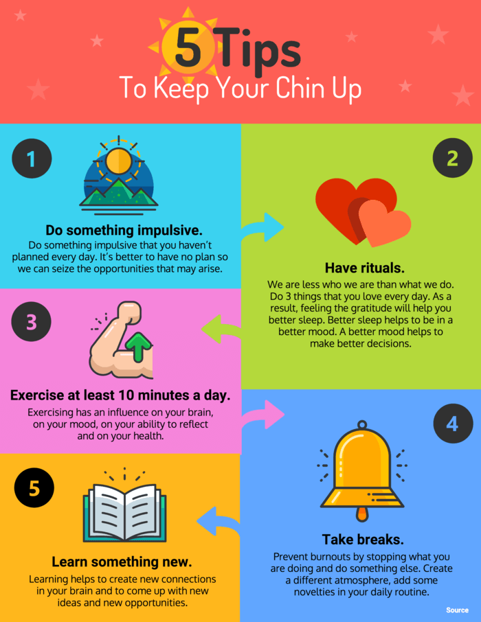
As in the example below, infographics use striking, engaging visuals to communicate information quickly and clearly.
Infographics are a valuable tool for visual communication. The most visually unique, creative infographics are often the most effective because they grab our attention and don’t let go.
But it’s crucial to remember that the visuals in an infographic must do more than excite and engage.
They must help us understand and remember the content of the infographic, as seen in this infographic about employee resignation announcements:
Why are infographics used?
Infographics are great for making complex information easy to digest. They can be helpful anytime you want to:
- Provide a quick overview of a topic
- Explain a complex process
- Display research findings or survey data
- Summarize a long blog post or report
- Compare and contrast multiple options
- Raise awareness about an issue or cause
When you need to give someone a really quick rundown on something that can be hard to explain in words alone, an infographic is a good way to go.
This means that infographics can be useful in pretty much any industry.
Marketing infographics
What are infographics used for in marketing?
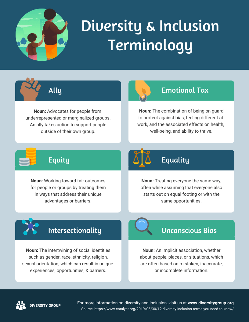
Marketers use infographics to build brand awareness and boost engagement about topics important to the company, such as this infographic on diversity and inclusion:
Marketers can use infographics to:
- Showcase your business’s achievements on a landing page or downloadable one-pager
- Send a visually striking newsletter to deliver news, showcase a new product or service or demonstrate thought leadership
- Improve their online courses or course handouts
- Drive interest on social media. Share snippets on Instagram or the full infographic on Pinterest.
- Make a roundup infographic. Collect quotes from influencers, compile them in an infographic and write a blog post around it.
- Summarize key points in a white paper or ebook.
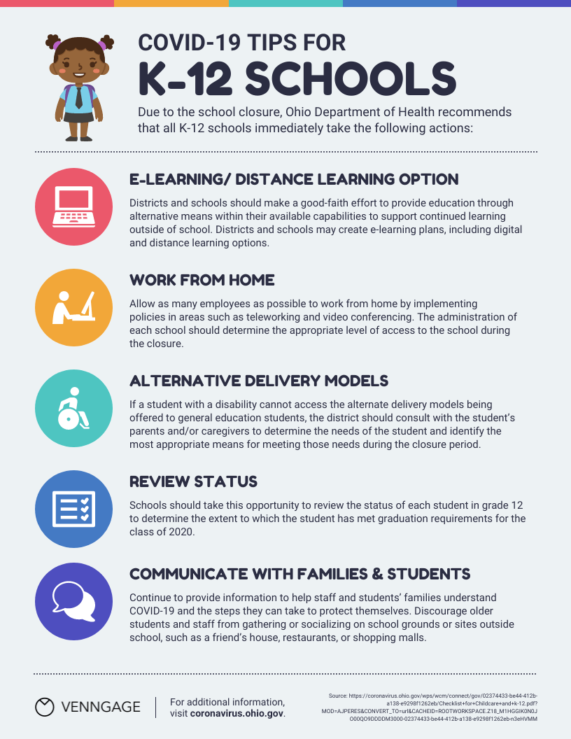
Infographic examples, like this one for schools, are great tools for educating a variety of audiences.
Consulting and freelancer infographics
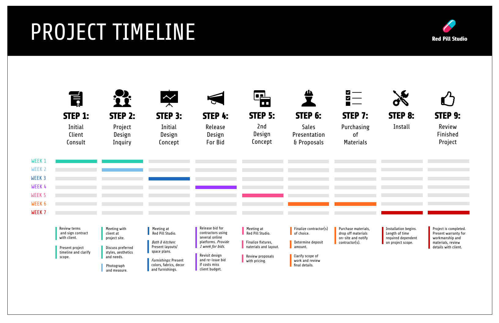
Consultants use timeline infographics to visualize project timelines and to simplify new/industry-specific topics to their clients:
Consultants use infographics to:
- Present data in a fresh way in client presentations
- Strengthen your argument and visualize timelines in client proposals
- Deliver progress reports to clients. Include an infographic in your report to visualize project timelines or progress “by the numbers”
Small business and entrepreneurship infographic examples
Small businesses and entrepreneurs use infographics to reach new audiences and increase brand awareness:
Lists are a common type of document that all businesses have. But long lists can get tedious to read. It’s unlikely that readers will even remember the items on the list.
Businesses can use infographics to visualize lists for better learning retention, like this colorful infographic example below.
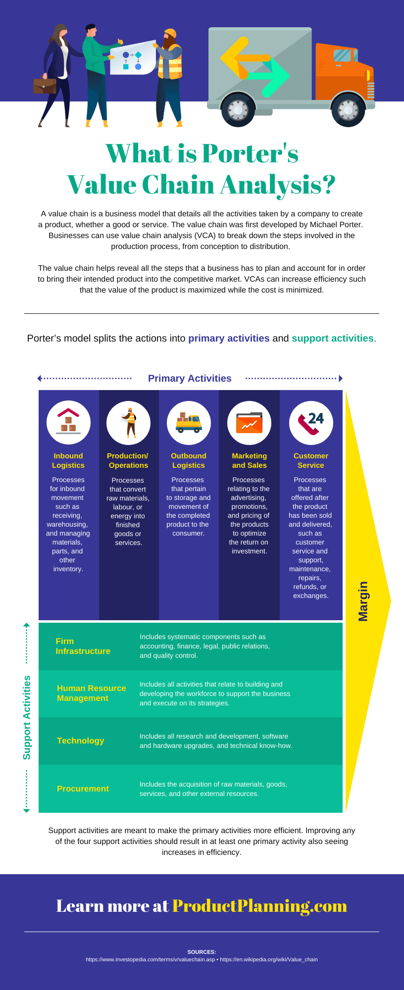
A business may also want to visualize processes and activities. This infographic example on supply chain analysis could easily have been a boring document.
Instead, the topic is covered more thoroughly and succinctly in an infographic.
Small businesses and entrepreneurs can use infographics to:
- Create their brand style guide
- Highlight their offerings and past successes in flyers and brochures
- Promote their business or demonstrate thought leadership on social media
- Better showcase products/services and past successes on their website’s sales page or in a downloadable one-pager
- Showcase your company’s history on their website’s about page
- Send creative newsletters
- Create more interesting webinars
Government infographics
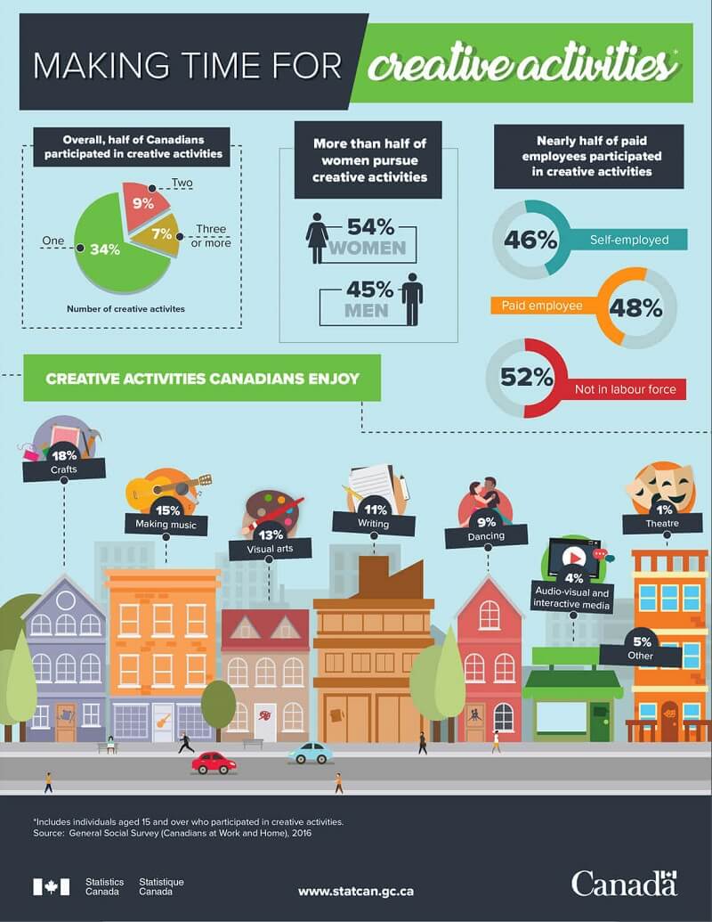
What are infographics used for in the governmental sector? Governments use infographics to share statistics and census data, like in this visual from the Government of Canada.
Nonprofit infographics
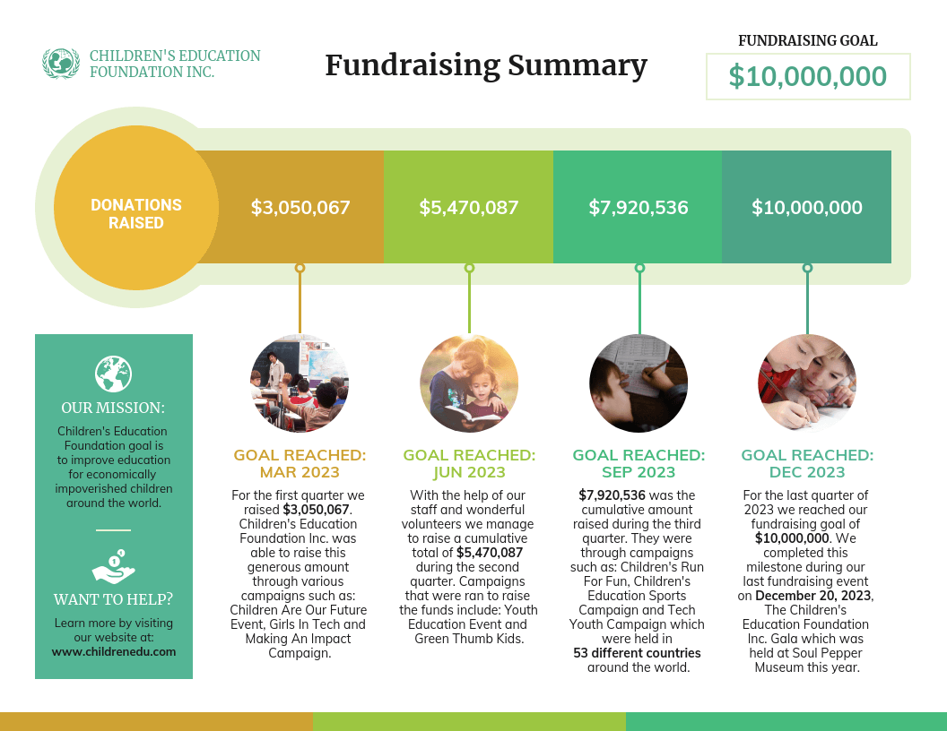
And nonprofits use infographics to promote events and raise awareness for their causes or to showcase their successful fundraising efforts:
Nonprofits use infographics to:
- Make data and information about a given cause easy to understand. This can be applied to a newsletter, social media campaign, donation page, poster, and more.
- Plan a campaign strategy
- Show the impact of a fundraiser that can be sent to donors in an email
- Highlight results in an annual report
- Showcase successes in an impact report
- Visualize information in crisis communications
Education infographics
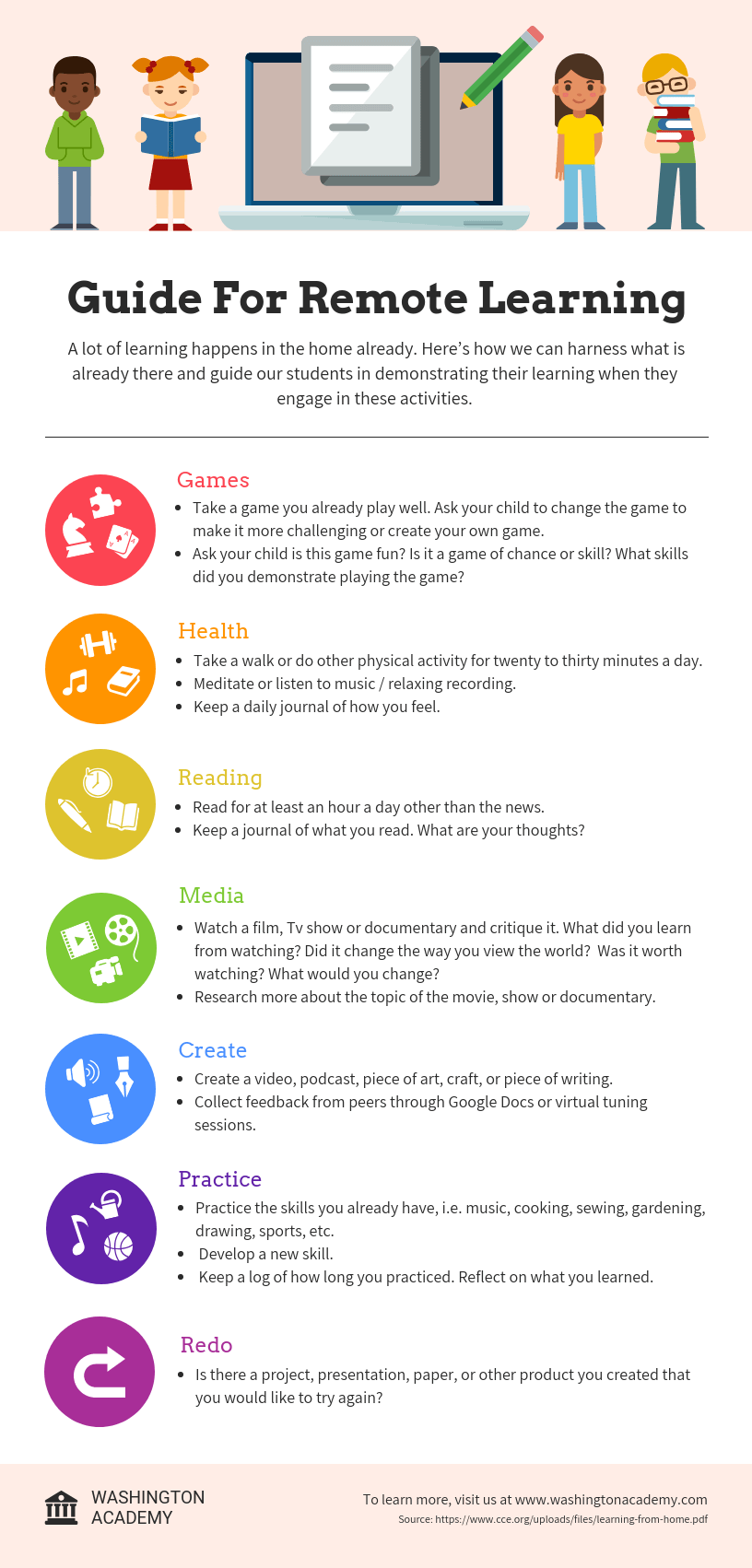
Educators and trainers use infographics to make content more memorable for students and employees:
Tips for creating an infographic
1. Organize your information with an infographic outline
The process of creating an outline will help you organize your thoughts and ensure that your content will work in an infographic.
Create an infographic outline from existing content using these 4 steps:
- Determine the key takeaways of your content
- Determine the title, headers, subheaders, and facts
- Consider the length of paragraphs and points
- Include notes for the designer
2. Pick an infographic template
Once you’ve got an outline, you’re ready to pick an infographic template.
Pre-made infographic templates (like the one below) can give you the design inspiration you need to get your infographic rolling. Even just using them as a jumping-off point can be helpful.
3. Customize your infographic
Once you’ve chosen an infographic template, you can start customizing it to your needs.
What are the different types of infographics?
- Statistical infographics
- Informational infographics
- Timeline infographics
- Process infographics
- Geographic infographics
- Comparison infographics
- Hierarchical infographics
- List infographics
- Resume infographics
What makes an infographic design effective?
When it comes to designing an effective infographic, it’s important to recognize that our brain seeks patterns in visual information to help us make sense of the world.
We can use this idea to structure our information visually and create patterns that will enhance the message that we’re trying to communicate.
Let’s run through some infographic design best practices to help you create infographics that are as effective as they are beautiful.
Use lines, borders, and shapes to group related information
Even something as simple as the position and grouping of elements on a page can influence the way our readers understand our graphics.
If we use basic design elements like borders, lines, circles, and squares to visually organize our content, our readers will find it easier to interpret that content.
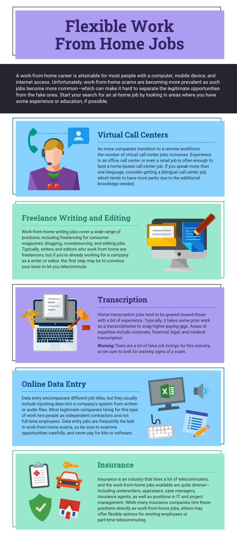
For example, we can enclose related elements within an outline or a shape. Most infographics, like the one below, use this tactic to break up the design into multiple sections, making the graphic easier to scan.
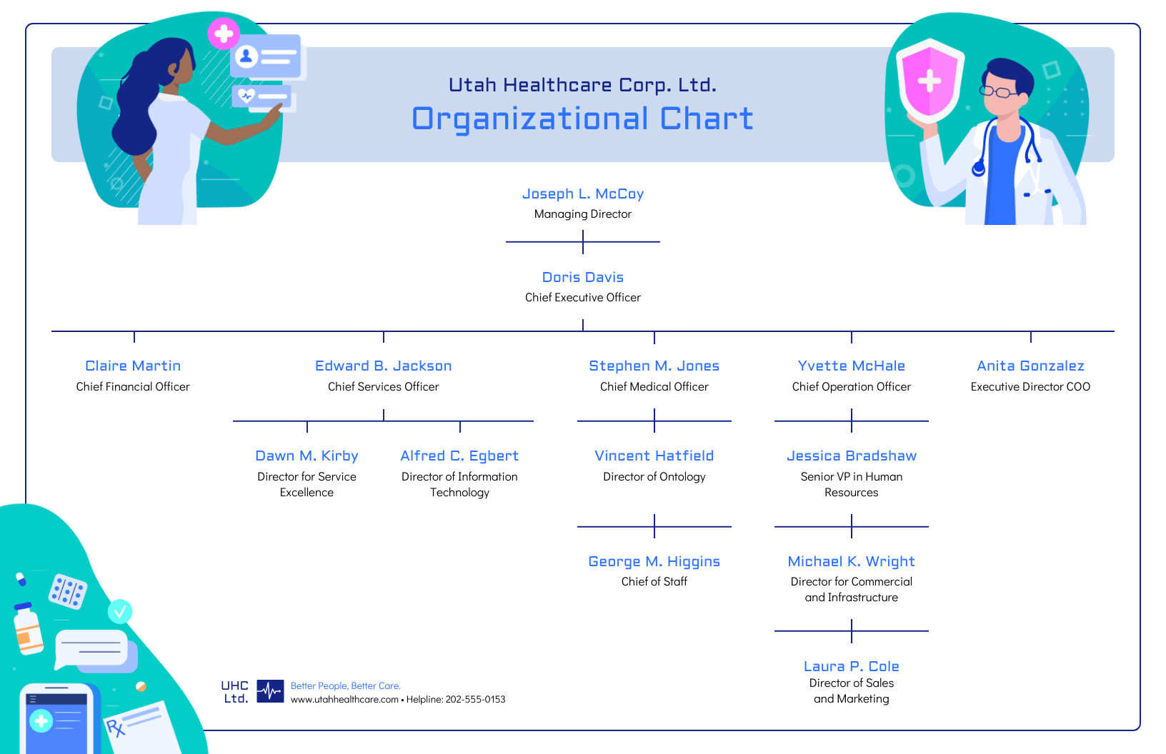
Alternatively, when the structure of the information is the main focus of the infographic (like in an organizational chart or a flow chart) it can be helpful to explicitly connect related elements with lines. Like in this marketing flow chart infographic:
Use contrasting colors to guide your readers’ attention
Another major design element to think about is color. We’re naturally inclined to use color to make infographics look pretty, but color can also be used as a powerful communication tool.
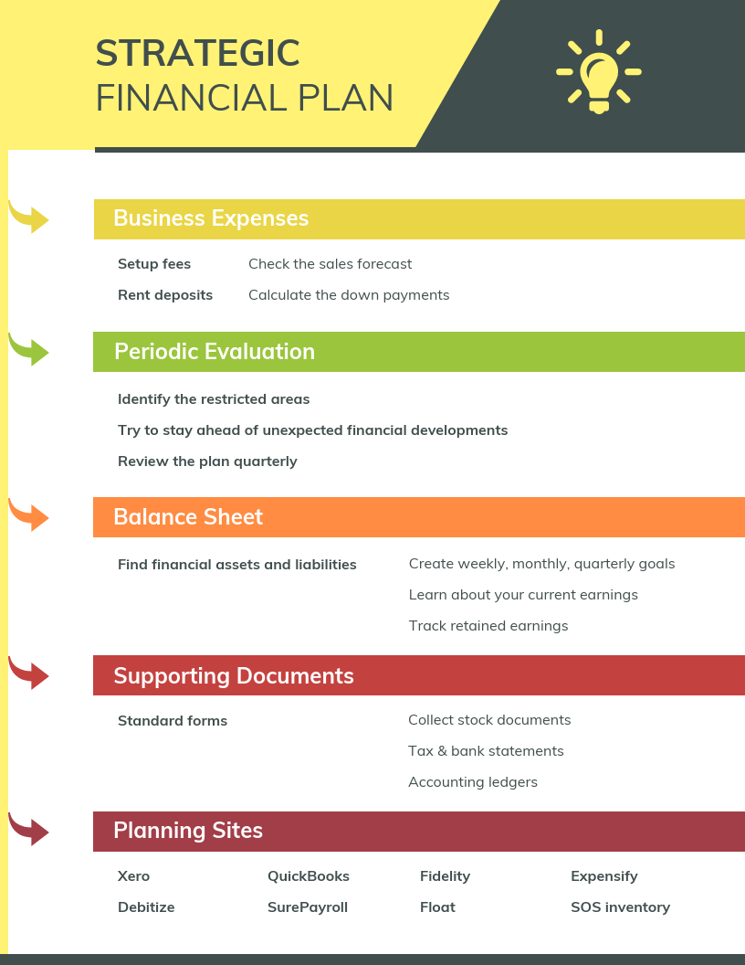
Just like lines and borders, colors can be used to indicate information groupings, as seen in the business strategy infographic example below:
But more importantly, we can use color to draw attention to particular pieces of information and push supporting information into the background.
Pick one color that contrasts with all of the other colors in the graphic, and use it to make the most important information stand out.
Create a text hierarchy with three different font styles
Fonts are one of the first things people notice when they first look at an infographic. If chosen poorly, fonts can ruin an otherwise great infographic.
The key to using fonts correctly in infographics is to create a clear text hierarchy with three different font styles–one for the main heading, one for the section headings, and one for the body text.
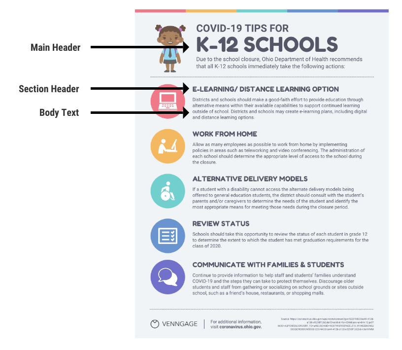
The main header font should be the biggest and can be the most stylized. Think of it as the way to set the mood of your infographic.
The font for the section headers should be a bit smaller and less stylized, but it should still stand out on the page.
Finally, the font for the body text should be the smallest, and not stylized at all. It needs to be as easy to read as possible.
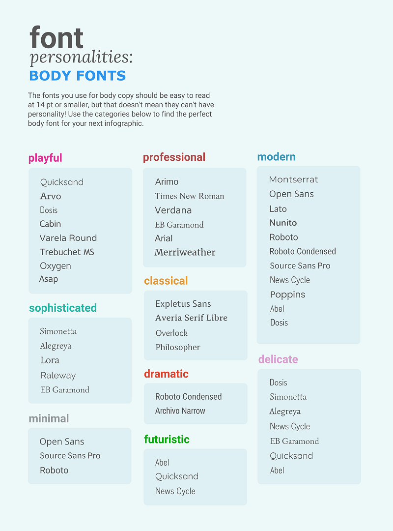
Not sure what a readable font looks like? Here’s a quick reference guide to fonts that are great for body text:
Use images, icons, and illustrations to make key takeaways memorable
Last but certainly not least, make sure that the focus of your infographic is on visuals like images, symbols, icons, illustrations, and data visualizations like charts and graphs.
Visuals are crucial for making your information engaging and memorable. The best infographics have an equal balance of text and visuals.
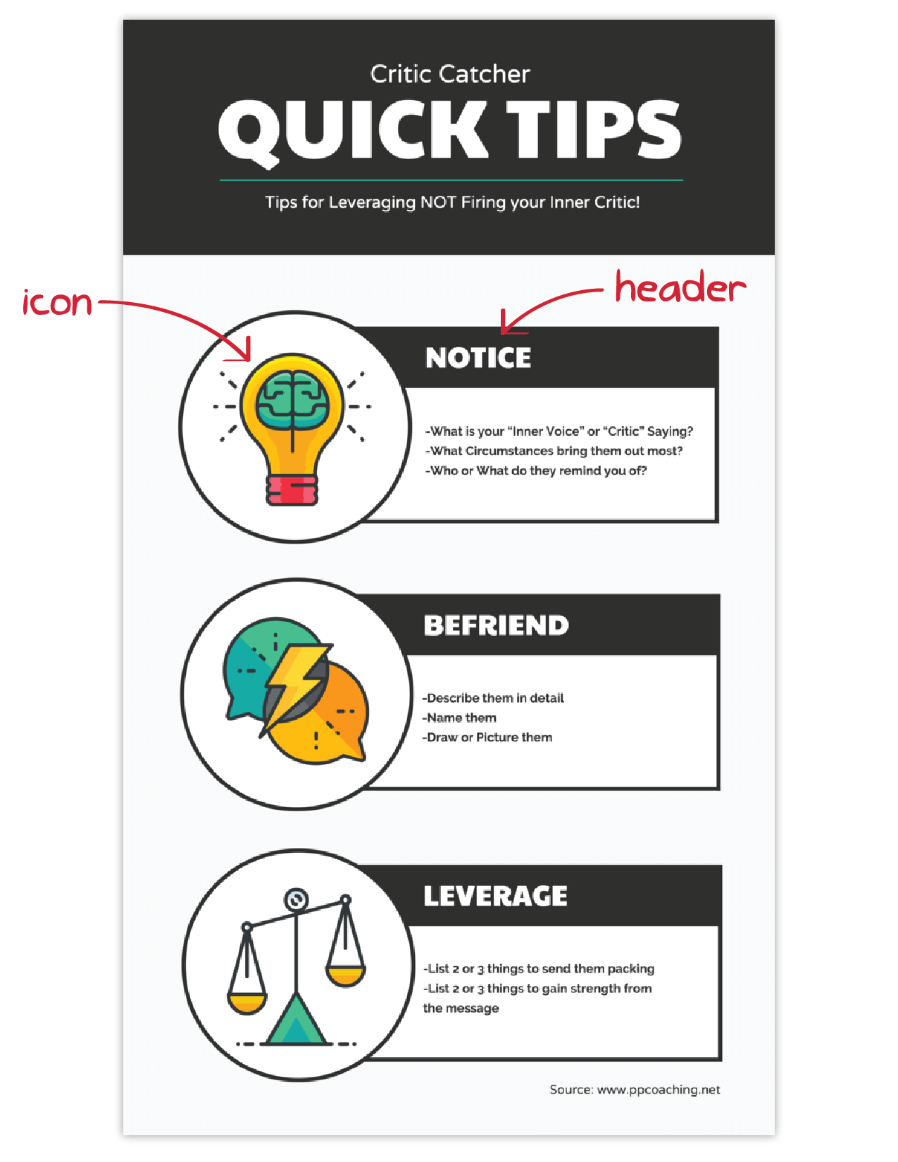
The easiest way to make sure you have enough visuals in your graphic is to add an icon to represent each header, as seen in the example below:
Conclusion
The best infographics use a combination of text, images, and data to inform and engage.
If you’re ready to create infographics that strike the perfect balance between fun and educational, make sure you follow these infographic design best practices:
- Use lines, borders, and shapes to group related information.
- Use one contrasting color to draw attention to key information.
- Create a text hierarchy with three different font styles.
- Use images, icons, and illustrations to make key takeaways memorable.


